Occassional thoughts about orienteering
| okansas.blogspot.com Occassional thoughts about orienteering |
|
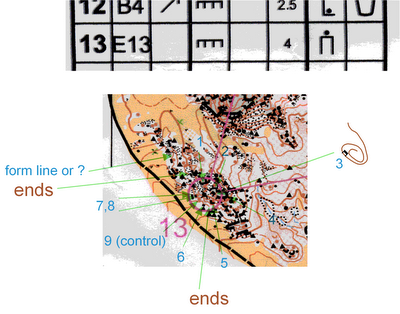
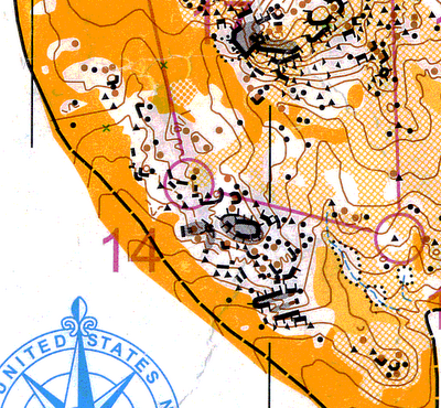
Thursday, August 24, 2006 Map printing comparisonVladimir posted scans of two maps of the same rocky hill in Colorado. Comparing the two bits of map is a dramatic demonstration of the outcome of 2 differnt methods of printing the maps.  Fashion Update Judging by the number of comments and page visits today, there is a lot more interest in O' fashion that I'd expected. Look for more WOC suit analysis in the coming days. posted by Michael | 8:46 PM
Comments:
It is a closer battle if you compare similar sized map snippets. Sure the great big one is going to look better. The offset printed map still looks better, but I think it is mainly because it is less cluttered.
It is not only printing. What about different scale, mappers presentation, scanning of the map and format of the file. Even control descriptions doesn't look fine.
Still: with offset printing you get a better readability, than laserprinting and the first map is definitely from a Laserprinter, or??. I understand that laserprints (incl. routes) are easier to handle for the organizers, but for the runners offset is the better!
I think because of my inexperience, I have no idea between offset maps and laser maps and whatever the heck other kind of maps there are. They give me a map, and I run.
Post a Comment
Also, I think looking at that scan of the US Champs map is a little garbled. I have the real-deal map sitting here in front of me, and it's definitely clearer than this GIF. I didn't have any problems with this leg, and I have no reason to blame the printing method for anything. |
|
||||
|
|
|||||