Occassional thoughts about orienteering
| okansas.blogspot.com Occassional thoughts about orienteering |
|
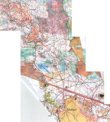
Tuesday, July 25, 2006 More thoughts on Oringen mapsThe Oringen maps were very detailed. Take a look at the map below with Eva Jurenikova's routes from the first super elite race. The course begins in a very detailed area that is a bit hard to read. It was especially difficult at 1:15,000. I was grateful that my class had 1:10,000 maps. Even then, I used a magnifier almost the entire time. The super elite maps were actually a bit easier to read than the maps the rest of us used. When I actually got my hands on one of the super elite maps, I was surprised to see that it was printed differently than the maps the rest of us used. The super elite maps were printed on regular paper, while the rest of us (the less-than-super-elite) had maps printed on tyvek. Tyvek is a tough, water proof paper. An O' map printed on tyvek doesn't need a map case, but it also doesn't seem to print as well as regular paper. So, what do I think of the Oringen maps? I thought the maps were good. The mapper had some difficult problems to solve. The terrain was quite rocky in places and making decisions about how to map the rocks must have been difficult. From what I could see, the mapper was pretty consistent in dealing with the rock features. The tyvek paper was ok. It would have been easier to read and use the maps if they'd been printed on regular paper and put in plastic map cases. But, I can appreciate that the organizers had a bit easier time dealing with the maps by printing them on tyvek. I'm sure lots of people didn't like the level of detail on the 1:15,000 maps. They could be really difficult to read. Maybe there are rules about using 1:15,000 maps rather than 1:10,000 for elite categories? I can't see the value in forcing people to use maps that are difficult to read. I wonder if the super elite runners would have preferred a 1:10,000 map? posted by Michael | 8:32 PM
Comments:
Post a Comment
|
|
||||
|
|
|||||